


-5.jpg)

































Thank you! Your submission has been received!
Oops! Something went wrong while submitting the form.

.avif)
July 9, 2026
Social media post design is the visual strategy behind every image, graphic, and video you publish on platforms like Instagram, Facebook, and LinkedIn — and it directly determines whether someone stops scrolling or keeps going.
Here's a quick breakdown of what effective social media post design involves:
The stakes are real. Posts with visuals receive 94% more views than text-only posts. Brands that maintain consistent visual design see up to 3x higher engagement rates. That's not a small edge — that's the difference between a post that gets buried and one that builds an audience.
Social media moves fast. Most posts have a lifespan of just a few hours. So your design has to do heavy lifting in a very short window.
I'm Miranda Motlow, founder of Motlow Pro Media, where I've spent over a decade helping brands — including casino marketing teams in Tampa, Florida — create short-form content that captures attention through intentional visual storytelling and social media post design that feels authentic, not generic. This guide covers everything you need to go from blank canvas to scroll-stopping content.
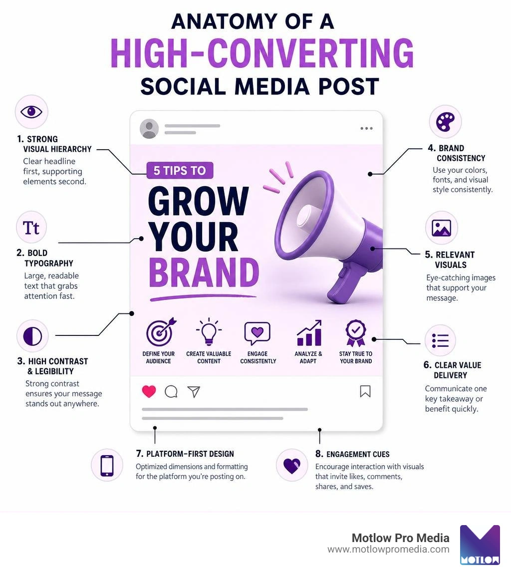
When you are scrolling through your phone at lightning speed, your brain processes images in a fraction of a second. If a graphic is cluttered, confusing, or just plain boring, your thumb keeps moving. To win the battle for attention in June 2026, we must rely on timeless design principles adapted for modern, feeds.

Good social media post design is not about making things "look pretty." It is about communication. When we design a post, we are structuring information so the viewer can digest it instantly. Let’s look at the core principles that make this happen.
Visual hierarchy is the arrangement of elements in a way that implies importance. It tells the viewer, "Look at this first, then look at this, and finally, read this." Without a clear hierarchy, your post becomes visual noise.
Colors and fonts are not just decorative; they carry deep psychological weight. They set the mood before a user even reads a single word.
Nothing ruins a beautiful social media post design faster than having your text cut off or your image pixelated because of incorrect dimensions. Each platform has its own set of rules, and they change constantly.
Below is a master reference table of the ideal dimensions and aspect ratios across the major social channels as of June 2026:
| Platform | Content Type | Ideal Dimensions (Pixels) | Aspect Ratio | Recommended Format |
|---|---|---|---|---|
| Square Post | 1080 x 1080 px | 1:1 | PNG / JPEG | |
| Portrait Post | 1080 x 1350 px | 4:5 | PNG / JPEG | |
| Stories & Reels | 1080 x 1920 px | 9:16 | MP4 | |
| Standard Post | 940 x 788 px | ~1.2:1 | PNG / JPEG | |
| Cover Photo | 820 x 312 px | 2.63:1 | JPEG | |
| Single Image Post | 1200 x 627 px | 1.91:1 | PNG / JPEG | |
| Portrait Carousel | 1080 x 1350 px | 4:5 | PDF (for carousels) | |
| YouTube | Video Thumbnail | 1280 x 720 px | 16:9 | JPEG / PNG |
When designing for feeds, height is your best friend. On mobile-dominated platforms like Instagram and LinkedIn, portrait crops (4:5 aspect ratio) take up significantly more vertical screen real estate than standard squares. More screen space means more time in front of your customer’s eyes.
When we design for Instagram, we also have to consider the profile grid. Because the grid crops everything into a 1:1 square, any crucial text or faces in a 4:5 portrait post must be kept within the central square area so your profile page remains clean and cohesive.
For vertical, immersive formats like Instagram Stories, Reels, and TikTok, the standard is 1080 x 1920 pixels (a 9:16 aspect ratio).
When designing static or animated graphics for these vertical formats, always leave a "safe zone" at the top and bottom of your canvas. The top 15% and bottom 15% of the screen are usually covered by platform user interfaces, profile icons, and action buttons. Keep your text, logos, and critical visual hooks strictly in the center 70% of the screen.
If every single post you publish looks identical, your feed will become boring, and your audience will tune out. However, if every post looks completely different, you will fail to build brand recognition. The secret is finding the sweet spot where brand consistency meets creative variety.
Brands that maintain a highly consistent visual identity across social media enjoy up to 3x higher engagement rates. When a user is scrolling, they should be able to recognize your post as yours before they even look at your username.
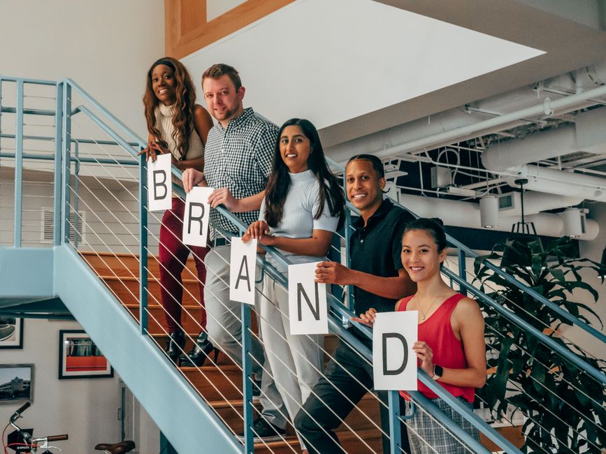
To achieve this balance, we build a brand kit or a visual style guide. This system acts as a set of guardrails, allowing for creative freedom while maintaining a cohesive look.
Different messages require different formats. A great social media manager knows how to match the content type to the graphic layout:
In 2026, you don't need a master's degree in graphic design to produce high-quality social media assets. A robust ecosystem of tools exists to help creators, small business owners, and marketing teams create professional designs in minutes.
If you prefer a template-based approach, platforms like Canva (trusted by over 75 million customers globally) and VistaCreate's free graphics maker offer hundreds of thousands of pre-made layouts, royalty-free stock assets, and background removal tools. If you are working on the go, the Social Media Posts Design App on the App Store gives you access to thousands of ready-made post templates and mobile-friendly photo editing tools directly from your phone.
For those looking to bypass templates entirely and generate original designs from scratch, AI tools are changing the game:
While these tools are fantastic for scaling daily content, high-value campaigns and long-term brand building often benefit from professional oversight.
If you are looking to outsource your social media design, the landscape is vast. On freelance platforms like Fiverr, there are over 50,000 social media design services offered, with prices ranging from $20 for a single post to $2,500+ for comprehensive monthly packages.
When hiring a designer or agency, look for clear packages that outline:
Design is never purely subjective; it is rooted in data. To truly understand if your social media post design is working, you must monitor your performance metrics.
Use A/B testing (split testing) to refine your designs over time. Try publishing the exact same caption and hook, but use two different visual styles:
Analyze the engagement rate, shares, and saves. Often, you will find that certain formats perform vastly better for educational content, while others excel at driving direct sales. Let the data guide your next design cycle.
A standout graphic relies on a strong visual hook, high contrast, and a clear focal point. It should communicate its core message in under two seconds. Keeping up with current visual trends—such as bold retro typography or clean, minimalist editorial layouts—also helps your content feel fresh and relevant.
The key is selective adoption. You don't need to jump on every design trend. When a popular trend aligns with your brand voice, incorporate it using your brand's primary colors or fonts. This allows you to look current while remaining instantly recognizable.
If you want to use a single image across multiple platforms, a vertical portrait crop of 1080 x 1350 pixels (4:5 aspect ratio) is highly effective. It fits perfectly on Instagram and LinkedIn feeds, taking up maximum screen real estate on mobile devices without getting awkwardly cropped.
Mastering social media post design is a continuous journey of testing, learning, and refining. By focusing on strong visual hierarchy, keeping your platform dimensions precise, and maintaining a cohesive brand identity, you can turn a blank canvas into a highly engaging, scroll-stopping asset.
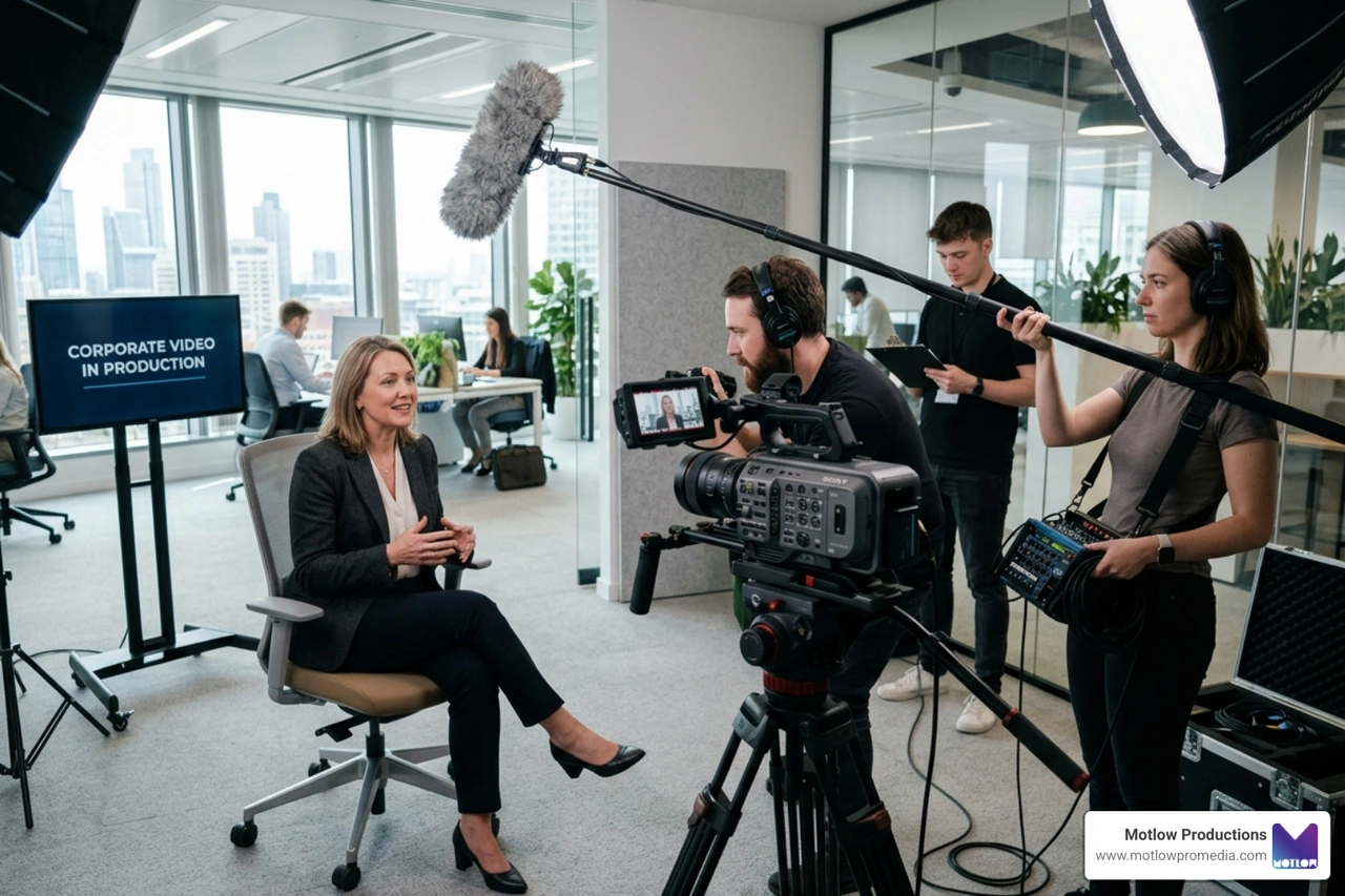
At Motlow Pro Media, based in Tampa, Florida, we understand that high-quality content production requires a delicate balance. We specialize in corporate media production, short-form content strategy, and live event support, offering our clients a unique "hands-off, but hands-on" partnership. We act as a seamless, trusted extension of your marketing team, handling the heavy lifting of visual storytelling so you can focus on running your business.
Ready to elevate your brand's visual identity and capture the attention your business deserves? Explore our Motlow Pro Media Services and let's build something exceptional together.
Some clients want to give notes in a live Zoom call. Others prefer a group text or email thread. However you like to communicate, we adapt. You’ll never be left guessing where things stand - and you’ll always have a say before anything goes out the door.





Phone:
+1 863-250-8639
.png)
Email:
info@motlowpromedia.com